
Improving an existing store
LaLaguna is a natural cosmetics brand inspired by the Venetian lagoon. Its store combines skincare, accessories and a distinctive visual world: photography, video and graphic compositions accompany product discovery.
Our work focused on bug fixes and new features for the existing Shopify store. The aim was to preserve that identity while addressing display and navigation details that could get in the way of browsing.
Addressing video loading and cropping
The project brief identified slow loading for both the opening video and the video near the bottom of the page. On some phones, videos also appeared in a square frame that cropped part of the content.
The work therefore addressed two complementary concerns: media loading and how video framing responds to screen size. The goal was to preserve the composition of the footage without letting the mobile format hide important details.
Keeping the layout consistent across screen sizes
Some images, including the yellow-and-blue stripes and seashells, did not scale correctly when the browser window changed size. Images and videos on the homepage also showed alignment issues against the theme’s grid.
Responsive corrections and alignment adjustments focused on bringing these blocks into a consistent composition. In a store where imagery carries much of the brand identity, how media behaves matters as much as which assets are selected.
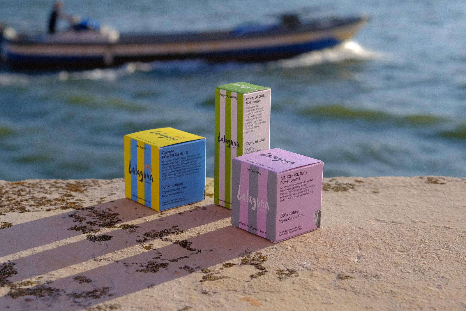
Photography from LaLaguna’s current website, included to illustrate the brand’s visual identity. This is not a before-and-after comparison.
Making navigation respond to context
The header changes followed two specific rules: hide the “HOME” link at the top of the page and reveal it after scrolling; keep the cart hidden while it is empty.
These behaviours tailor the visible navigation to the visitor’s current context while keeping a route back to the homepage available as they browse.
Refining the contact page and product galleries
The contact page had a large area of unused space on the left. The scope included placing the LaLaguna logo there to balance the composition and carry the brand identity through to this part of the journey.
Another part of the work concerned product-photo ordering, with the goal of allowing product-page galleries to change without affecting homepage imagery. This separates two different needs: introducing the brand on the homepage and presenting a specific item on its product page.
Detailed work on an established experience
The assignment combined corrective maintenance with focused improvements to media, responsive behaviour, grid alignment, navigation and product presentation. It demonstrates our approach to existing Shopify stores: making specific improvements without rebuilding the entire experience.